What to keep in mind and things to avoid

 Tips & Advice
hidden for layout purposes
Common sense and practice
 The other sections in this topic mention Best Practices throughout. In this section, we’ll combine all of them into one document. Volumes have been written on the “how to” of desktop publishing, blogs have come and gone on the subject. At the end of the day, what it takes is some common sense and practice. When you work creatively, with any medium and in any genre, you should never be so self-absorbed or sensitive to think that none of your work needs any scrutiny. On the contrary, the more people who look at it (while avoiding indecision by committee), the better, before you put it in front of the world.
Collapse All
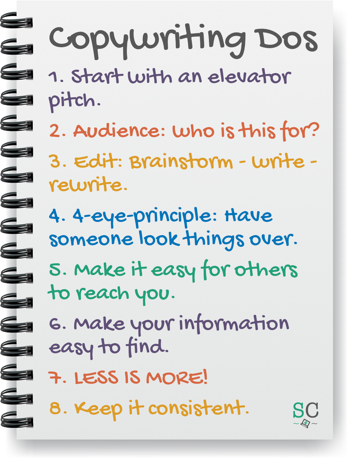
Tips (Dos)
- It is easiest to start with a predesigned template, no matter what medium you are designing for. This way you don’t waste time reinventing the wheel, and you can also be sure that the end result looks professional.
- Before you sit down to design your next newsletter or brochure, ask yourself: “Who’s this for? What do they want or need?”
- Just like your message should be consistent, as mentioned in the section on copywriting, so should your overall look be. Why? It makes you look professional and like you know what you are doing. So, even if you are a small grassroots group, you will look “bigger” simply by presenting yourselves a certain way.
- Keep your colors consistent. Pick one main color, or perhaps two. You don’t need to get into the specifics of “hex” color codes and all that, just somehow note somewhere what those main colors are. Then, whatever you do, stick with those colors. Please note: black and white don’t count here, neither does gray.
- Keep your fonts consistent. Pick one main fancy font for headers and such, and one easily legible font for text, maybe another one for the Web. For example, that combination you see at work all over the Shoestring Collective (American Typewriter and Montserrat for all of the infographics and other print materials). Check out the information on Google Fonts (they will provide you with pairing suggestions on their site as well) and our document regarding how to install a font.
- Always take the time to properly plan what you’ll be writing.
- Brainstorm
- Write
- Revise, refine and rewrite
- 4-eye principle: another person should always edit your work. Keep an open mind to input from others.
- Always make it easy for your audience to reach you.
- Make your information easy to find.
- Less is more, and white space is your friend.
[Click here to close]
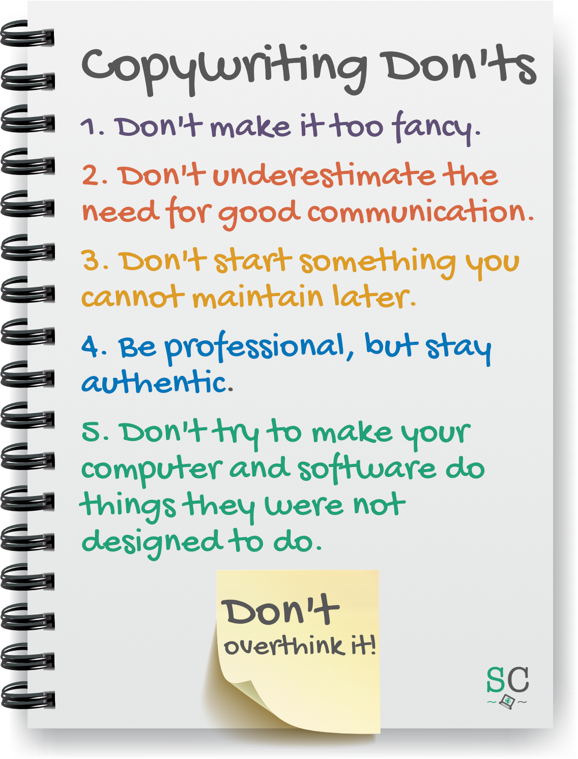
Traps (Don'ts)
- A brochure or other printed piece does not have to be shiny or fancy. On the contrary, this can be a turn-off for potential donors or volunteers, because they have to assume that what they are donating goes into these shiny brochures etc., rather than benefiting the cause.
- Don’t start manipulating a predesigned template just for the sake of manipulating it, especially if you are unsure of the subject matter. It’s potentially like changing key ingredients in a recipe and then wondering why the finished product doesn’t turn out.
- Don’t start something you cannot maintain. It’s better to have no newsletter than to announce a monthly one and then not send it, or to send it once every blue moon. Alternatively, call it “Update” and send it whenever there is one.
- Don’t try to force your desktop publishing software to be something it isn’t. Microsoft Word is not Excel. Likewise, PowerPoint is not Word. Etc. Whatever you are using to write and design, keep in mind what it was made for in the first place. While these programs have certain capabilities beyond their primary use, forcing them to be more than this is the proverbial square peg/round hole scenario. It will cause a lot of unnecessary headaches.
[Click here to close]