The Rule of Thirds: Examples
How Can We Help?
Photography Examples:

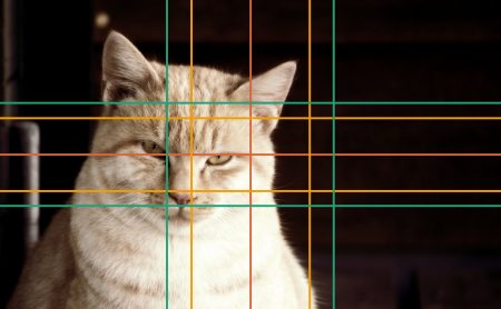

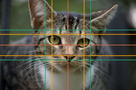
You can successfully apply these principles to pretty much any picture, whether it is a photograph, graphic or watercolor picture.
Applied to Layout Basics:
Consider this brochure. It is a trifold, which means that one panel at the right will be the “cover” page. This is the one we’ll look at more in depth.
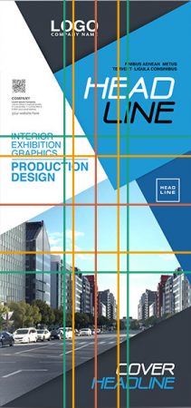
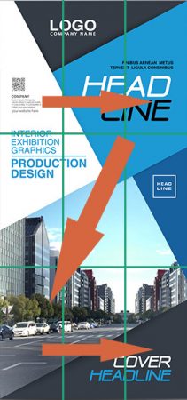
While they have taken some liberty with the placement of elements here (after all, nothing is cast in stone and, to beat a dead horse, rules are made to be broken), they are still sticking to some basic principles:
- The headline gets prime real estate in the top right.
- The logo is roughly in within the Golden Ratio on the left.
- The picture of the street scene occupies the majority of the lower two thirds.
- The way the color blocks are arranged, your eye wanders automatically along the lines from the top left to the lower right.
An email newsletter, on the other hand, is typically (or better, ideally) fairly simply designed, like in this example:
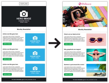
You can clearly see here, even without guides, that the main image is occupying the upper third of the publication. Since a computer display will only display the first part of the newsletter, that is where you want to put your most important posts/information.